Best Places to Embed Explainer Videos for Maximum Conversions
2026-06-24T17:27:51
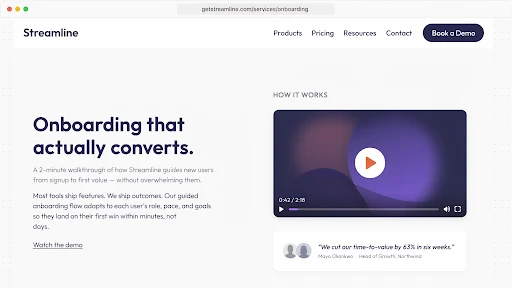
Table of Contents
Video placement landing page conversion is not just a design choice. It is a timing choice. A good explainer video can still underperform if it appears after the visitor has already made up their mind, or worse, if it appears before they even know why they should care.
That is usually where brands lose the value of the video.
They spend time on the script, animation, voiceover, and edits. Then someone drops the video into a random section because “it looks nice there.” Nice is not the goal. The goal is to help the visitor move past doubt.
The best spot for a video is often the place where the visitor quietly pauses and thinks, “I need a little more before I click.”
Start With the Page’s Real Job
A homepage does not behave like a product page.
A pricing page does not behave like a blog post.
A paid landing page is even less forgiving because the visitor came from one specific promise. They are not there to explore your whole brand story. They want the thing the ad mentioned.
That is why explainer video placement has to start with the page goal. Is the page trying to explain a new product? Sell a service? Push a demo request? Help someone compare plans? Reduce support questions?
The video should support that one job.
Before asking where to place explainer videos on a website, ask what question the page must answer before the visitor takes action. That question is the video’s home.
Above the Fold Is Not Always the Answer
A lot of teams automatically want the video near the top.
Sometimes that works. An above the fold video can help if the offer is hard to explain with a headline and two lines of copy. Technical SaaS products, healthcare services, fintech platforms, and unfamiliar B2B tools often need a quick visual explanation early.
But above the fold can also become a cluttered mess.
A hero section may already have a headline, subheading, CTA, product image, badges, and social proof. Add a large video and the visitor has too many things fighting for attention.
So, should an explainer video be above the fold?
Only if it helps the first decision. If the visitor needs to understand the problem first, place the video after the opening section. Let them feel the need before asking them to watch.
A smart explainer video services company should look at the page flow before suggesting placement. The video file is not the whole strategy. The viewing moment matters too.
A Hero Video Must Earn Its Space
A hero video should make the headline clearer.
If the page says, “Reduce customer onboarding calls without adding more support staff,” the video should show that pain quickly. A confused user. A crowded support inbox. A cleaner onboarding flow. Then the outcome.
What it should not do is open with a slow logo animation and a broad company intro.
A homepage explainer video works when the visitor finishes it and says, “Okay, I get what this does.” That is the standard.
Keep the hero video short. Use a thumbnail that tells people what they are about to learn. Put a simple line near the play button.
“See the workflow in 60 seconds” is stronger than “Watch our video.”
One gives a reason. The other just asks for time.
Place the Video Where the Visitor Starts Doubting
The best video placement is not always the most attractive section.
It is the section where doubt starts.
On a service page, that may be after the main promise. The visitor likes the offer but wants to know how the process works.
On a product page, it may be beside the feature section. The buyer sees the feature names but cannot picture the product in use.
On a demo page, it may be near the form. The visitor wonders what happens after submitting it.
That is the logic behind the best places to embed explainer videos. The video should answer a live question. If there is no question at that point, the video becomes filler.
Product Pages Need Proof You Can See
A product page video has a simple job: show the product doing something useful.
Not a brand mood piece. Not abstract shapes. Not a voiceover saying “built for modern teams” while nothing specific happens.
Show the problem. Show the product action. Show the result.
For software, that may be a short workflow. For ecommerce, it may be size, use, setup, texture, or comparison. For technical products, it may be the part of the product a photo cannot explain.
If the product has internal parts, assembly, depth, or moving mechanics, a 3D explainer video company can help show what normal footage cannot. That video belongs near technical details, specs, or comparison sections because that is where buyers look for proof.
The page should feel clearer after the video, not just prettier.
Landing Pages Need a Tight Match
A paid landing page video should match the ad promise almost word for word in spirit.
If the ad promised faster reporting, the video should show faster reporting. If the ad promised easier onboarding, show the onboarding problem and the fix. Do not use a general company video here. It will feel disconnected.
This is how landing page videos increase conversions in the real world. They reduce the time it takes for someone to understand the offer. They also make the next click feel less risky.
Place the video near the main offer. Keep a CTA close. Give the video a headline that frames the point.
Landing pages are not built for wandering. They are built for one decision.
Pricing Pages Need Reassurance, Not Pressure
Pricing pages make people cautious.
They compare plans. They check limits. They wonder if the price is fair. They worry about choosing the wrong option. Sometimes they leave to “think about it” and never return.
A short video near pricing can help, but it has to be calm.
Use it to explain who each plan is for, what happens after signup, what support includes, or why one package fits a certain type of customer. That supports conversion rate optimization because it answers objections at the moment they become real.
Do not turn pricing into a hard pitch.
Pricing already feels like a decision. The video should make that decision easier, not heavier.
Human Problems Need Human-Led Videos
Some pages need the visitor to recognize themselves before they care about the solution.
A customer support product may need to show a tired agent handling the same ticket again. A healthcare service may need to show a patient trying to follow confusing instructions. An HR tool may need to show a manager struggling through a feedback conversation.
That is where a 2D explainer video company can help.
2D animation can show small human moments without needing actors, locations, or awkward staged scenes. It works well near pain-point sections because it makes the problem feel familiar.
Place that kind of video after the pain is introduced. Not at the bottom. If the video is meant to create recognition, do not hide it after the visitor has already scrolled past the emotional part.
SaaS Websites Need More Than One Video Spot
SaaS websites often put one explainer in the hero and stop.
That is rarely enough.
A SaaS explainer video company will usually think in smaller video moments. A homepage video explains the core promise. A feature video shows one workflow. A demo page video explains what the sales call includes. A help center clip reduces support questions. An onboarding video helps new users reach the first useful action faster.
That is the real point of explainer video placement for SaaS websites. The video should follow the buyer and user journey.
One giant video cannot answer everything. Several shorter videos, placed at the right moments, usually do more.
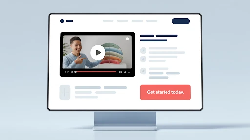
Forms Are Good Spots for Short Reassurance Videos
A form looks simple to the company. To the visitor, it can feel like a commitment.
Will someone call me right away? Will I get pricing? Is this a live demo? Will I be added to emails? How long does the response take?
A small video near the form can remove that uncertainty.
This works for demo pages, quote requests, consultation forms, webinar signups, trial pages, and enterprise contact pages. The video does not need to explain the whole service. It just needs to explain what happens next.
That is a useful video CTA moment. The video supports the action instead of pulling attention away from it.
Blog Posts Can Carry Explainers Too
Not every video belongs on a sales page.
Some belong inside blog posts, especially when the topic is a process, comparison, tutorial, or technical idea. A written guide can go deeper. A video can give readers the quick version.
That is part of a stronger website video strategy. Blog videos can support education, trust, and internal linking without turning the page into a hard sell.
Place the video after the intro if it summarizes the topic. Put it near the hardest section if it explains one tricky idea. Do not bury it at the end just because that looks tidy.
Tidy does not always help the reader.
Match Placement to the Funnel Stage
A sales funnel video should match how close the visitor is to buying.
Top-of-funnel visitors need quick clarity. Middle-of-funnel visitors need use cases, proof, or comparison. Bottom-of-funnel visitors need reassurance, pricing help, demo clarity, or next-step guidance.
That means the same video should not be pasted everywhere.
A broad explainer may work on the homepage. A workflow video may work better near features. A short objection-handling video may work near pricing or forms.
The warmer the visitor, the more specific the video should become.
Do Not Annoy People With Autoplay Sound
Autoplay with sound is still a bad idea.
People may be at work, on mobile, or in public. If sound starts without permission, many will close the tab before the message even begins.
Muted autoplay can work for short product loops. But for a real explainer, let people choose to watch.
Use a clear thumbnail. Add a visible play button. Write one sentence that tells people what the video covers. That usually helps video engagement more than forcing playback.
A useful video gets clicked. A forced video gets closed.
Test Placement Like You Test Copy
No one knows the perfect placement by instinct.
Try the video in the hero. Try it after the problem section. Try it beside the feature block. Try it near pricing. Try it above the form. Try a shorter cut if people are dropping off early.
Watch play rate, watch time, scroll depth, CTA clicks, form submissions, and lead quality.
Sometimes a lower video performs better because the visitor understands the context by then. Sometimes a small video near a form beats the big hero video.
Placement is not about what looks best in a mockup. It is about what changes behavior.
Final Words
Video placement landing page conversion works when the video appears at the moment the visitor needs help deciding. Use hero videos when the offer needs fast clarity. Put product videos near proof sections. Use pricing videos when cost creates hesitation. Add form-side videos when the next step feels unclear.
Use blog videos when the topic needs a faster explanation. A good explainer video can improve conversions, but only when the page gives it a real job.
Frequently Asked Questions
Related Articles:

evadmin
Expert contributor to the Explainer Video Company blog.