Animation Styles Compared: Whiteboard vs. Motion Graphics vs. 2D
2026-06-17T16:28:14
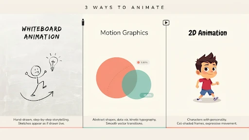
Table of Contents
The whiteboard animation vs motion graphics decision usually starts with someone saying, “Which one looks better?” That is the wrong starting point. A video style is not a wallpaper choice. It changes how people understand the message.
Whiteboard feels like a lesson being drawn in front of you. Motion graphics feel cleaner, faster, and more structured. 2D feels more human because it can show people, places, and small everyday situations.
All three can work. All three can also make a good idea feel flat if the style does not match the job.
Start With the Message, Not the Style
Most weak animation choices happen too early.
The team sees a reference video and falls in love with the look. Then the script gets forced into that style, even if it does not fit. That is how brands end up with a whiteboard video that should have been 2D, or a motion graphics piece that needed a simple character story.
Before choosing between explainer video styles, ask what the viewer needs.
Do they need to learn a process?
Do they need to understand a system?
Do they need to relate to a customer problem?
Do they need to see a product in use?
Do they need to trust the brand more?
The answer usually points to the right style.
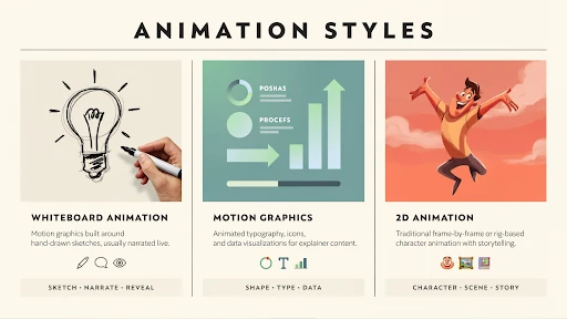
Whiteboard Animation Feels Like Teaching
Whiteboard animation works when the topic needs a calm, step-by-step explanation. It has that “watch this idea build” feeling. The viewer sees one point drawn, then another, then the connection between them.
That is why it can work well for policy explainers, nonprofit messages, healthcare basics, safety instructions, simple financial topics, and internal education. It does not ask the viewer to admire the visuals. It asks them to follow the logic.
If someone asks when to use whiteboard animation, use it when the idea needs teaching more than drama.
A company explaining a claims process, for example, may not need characters walking through a full story. It may need clear drawings, arrows, labels, and a voiceover that keeps the viewer moving.
Where Whiteboard Gets Risky
Whiteboard can also feel cheap if the execution is lazy.
You have seen the bad version. A generic hand draws a confused person, then a lightbulb, then a dollar sign, then three arrows. Nothing feels specific to the brand. Nothing feels new. The video looks like it came from a template.
That is the danger.
Whiteboard needs a strong script because the style is simple. There is nowhere to hide. If the message is vague, the whole video feels thin.
Brands using explainer video services should not choose whiteboard just because it sounds affordable. Choose it because the content benefits from a drawn explanation. For a premium product launch or a brand film, it may not have enough weight unless the concept is very sharp.
Motion Graphics Are Good for Order
Motion graphics animation is strongest when the video needs to organize information.
Dashboards. App screens. Data points. Payment flows. Timelines. Reports. Integrations. Internal systems. Product steps. All of that can become easier to understand with clean shapes, icons, labels, and movement.
This is why motion graphics show up so often in video marketing. They help explain an idea quickly without actors, sets, or a complicated animated world.
A fintech brand can use motion graphics to show how a payment moves. A logistics company can show how an order travels through a system. A SaaS brand can show how a workflow connects across teams.
It is not always emotional, but it is usually clear.
Motion Graphics Can Become Too Busy
The problem with motion graphics is overdesign.
Too many icons. Too much text. Too many arrows. Too many boxes sliding in from every side. The viewer starts watching movement instead of understanding the message.
That is bad news for product explainer videos, especially when the product is already complex.
Good motion graphics should feel guided. One idea appears. The eye knows where to go. The next point arrives only when the first one has landed.
Movement should earn its place.
If the animation is only there to keep the screen busy, cut it.
2D Animation Gives the Message a Human Face
2D animation works when the video needs a person, not just a process.
A tired manager missing updates. A patient trying to understand care instructions. A founder buried in reports. A customer support rep answering the same question again. A buyer comparing two options and hesitating.
Those are human moments. 2D handles them well.
A 2D explainer video company can build a small world around the problem: a character, a setting, a few scenes, a clear before-and-after. That helps the viewer see themselves in the story.
This is why animated explainer videos often use 2D for services, HR, healthcare, education, apps, customer support, and training. The style can explain the point without making it feel cold.
Where 3D Belongs in This Conversation
This article compares whiteboard, motion graphics, and 2D, but 3D often gets mentioned in the same meeting.
A 3D explainer video company is the better fit when the viewer needs to understand depth, shape, internal parts, assembly, movement, or physical space.
Think medical devices, industrial equipment, machines, architecture, hardware, product interiors, and technical systems.
That kind of explanation often needs 3D.
But 3D is not a shortcut to quality. For a basic service video or a simple SaaS workflow, 3D may only make the video more expensive. Use it when flat visuals cannot explain the thing clearly.
Best Animation Style for Explainer Videos
The best animation style for explainer videos is the one that removes the most confusion.
Whiteboard is best when the viewer needs teaching.
Motion graphics are best when the viewer needs structure.
2D is best when the viewer needs a human example.
That is the simple version.
The harder part is ignoring personal taste. A CEO may like one style. A marketer may like another. A product team may want screens everywhere. Fine. But the style should serve the viewer, not the meeting room.
A video is not being made for the people approving it. It is being made for the person watching it.
Whiteboard Animation vs Motion Graphics vs 2D
Here is the practical way to compare whiteboard animation vs motion graphics vs 2D.
Whiteboard teaches. It is useful for training videos, policy content, educational explainers, and step-by-step topics.
Motion graphics organize. They work for software, systems, data, features, product flows, and business animation videos.
2D tells a story. It works for customer situations, services, employee scenarios, healthcare education, brand stories, and user problems.
None of these styles can save a weak script. That needs to be said. A boring message with nice animation is still boring. The style supports the idea. It does not replace it.
SaaS Often Needs More Than One Style
SaaS brands ask this all the time: which animation style is best for SaaS videos?
The real answer is: it depends on the video.
A homepage video may need 2D to show the buyer’s daily frustration. A feature video may need motion graphics and UI screens. A help center clip may need screen recording with a few animated callouts. An onboarding video may need short product scenes and simple labels.
A SaaS explainer video company should not force one style across every asset. SaaS usually needs a video system, not one giant explainer.
One core video. A few feature clips. A few onboarding pieces. Maybe short customer education videos.
That is more useful than one long video trying to explain everything.
Frequently Asked Questions
Final Words
The Whiteboard animation vs motion graphics distinction is not about whether the approach is more visually appealing. The question is which one makes the message the most understandable. When teaching a topic, a whiteboard is useful. Motion graphics are useful when a concept requires structure, data, displays, or process clarity.
2D works when the audience requires characters, emotion, and a tale they can relate to. Start with the message. Then select the style. That arrangement saves time, money, and a lot of unnecessary creative argument.
Related Articles

evadmin
Expert contributor to the Explainer Video Company blog.