
Every agency pitch deck contains a slide claiming that video lifts conversions by some impressive percentage. The number changes depending on who is presenting. The source almost never appears.
So it’s worth asking plainly whether explainer videos move conversion rates, and if they do, by how much and under what conditions. The answer is more useful than the marketing version, because it tells you when to spend money and when to keep it.
This piece separates what the evidence supports from what gets repeated, then shows you how to find out for your own site.
Key Takeaways
- Yes, but the honest answer is smaller and more conditional than the figures usually quoted at you.
- Most eye-catching statistics come from vendor surveys or single undocumented case studies, neither of which proves anything about your page.
- The effect depends almost entirely on how hard your offer is to understand. Simple offers gain little.
- Length, placement, and whether the video autoplays can matter as much as the video itself.
- A controlled test on your own traffic is the only evidence that answers the question for you.
- Work out the payback threshold before production starts, not after.
The Short Answer: Yes, Though Rarely by the Margin You’ve Been Quoted
Video does lift conversion on pages where the offer is hard to grasp quickly. That effect is real and repeatedly observed by teams running controlled tests.
What isn’t supported is the idea of a fixed, transferable number. There’s no universal figure waiting to be applied to your landing page, because the size of the effect depends on your traffic, your offer, your price point, and how confusing your page currently is.
A more accurate framing: video is a comprehension tool. When comprehension is the bottleneck, removing it moves the numbers. When something else is the bottleneck, such as price, trust, or a broken signup flow, adding a video changes very little.
Teams treating explainer videos for conversions as a guaranteed multiplier tend to be disappointed. Teams treating them as a targeted fix for a specific problem usually aren’t.
Where Those Famous Conversion Statistics Actually Came From
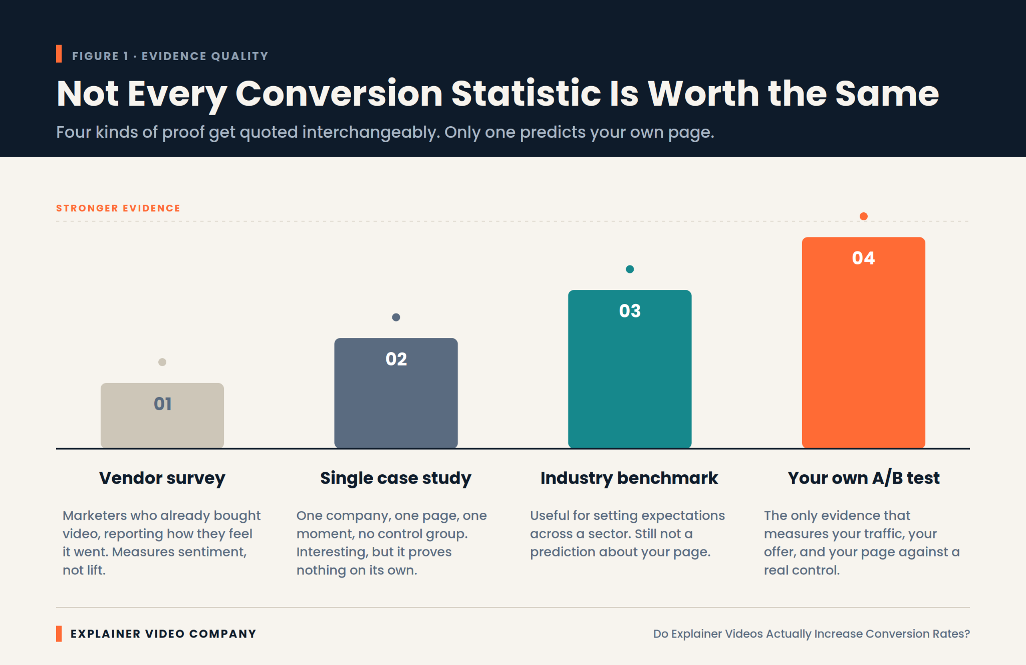
Most widely circulated figures trace back to one of two weak sources, and knowing which is which saves you from planning around fiction.
The first is the vendor survey. A video company asks its customers and newsletter subscribers whether video helped. People who already bought video say yes. That result measures sentiment among a self-selected group, not lift.
The second is the undocumented case study. A single company reports a dramatic improvement after adding a video. Usually there was no control group, the page was redesigned at the same time, and the traffic mix shifted. Something improved. Nobody can say what caused it.
There’s a third layer that makes it worse. Statistics roundup articles cite each other in a loop, so a figure invented for one blog post in 2013 acquires a decade of apparent authority simply by being repeated. Trace any impressive number back two or three links and it often dissolves into nothing.
None of this is dishonest exactly. It becomes misleading when these figures get quoted as though they were controlled experiments. Treat any statistic without a stated methodology as a claim rather than a finding.
Why Does Video Move a Conversion Rate at All?
It compresses understanding into less effort than reading does, for the specific kind of visitor who wasn’t going to read anyway. That’s the whole mechanism, and it explains both the wins and the failures.
A visitor landing on an unfamiliar product page is deciding within seconds whether to invest attention. Text asks them to assemble meaning themselves. A well-made video assembles it for them, showing sequence and cause in a form that needs no reconstruction.
That advantage isn’t universal, though. Usability research from the Nielsen Norman Group has long found that users scan pages rather than read them, and often skip video entirely when they’re hunting for a specific fact. Video wins on explanation. It loses on lookup.
Any explainer video conversion gain therefore comes from one narrow place: turning confused visitors into oriented ones.
The Effect Is Real, and the Range Around It Is Enormous
Expect wide variance, because baseline performance varies wildly before video enters the picture. This is the part that makes single-number claims meaningless.
Unbounce’s benchmark work on landing pages shows that median conversion rates differ several times over between industries. A page converting at 2 percent and one converting at 12 percent are not the same problem, and the same video will not do the same thing to both.
Diminishing returns matter too. A page that already explains itself well has little comprehension left to gain. The biggest recorded improvements tend to come from pages that were performing badly for a diagnosable reason.
So when someone quotes you a specific explainer video conversion rate improvement, the useful question isn’t whether the number is true. It’s what the starting point was.
Which Pages Have the Most to Gain
Prioritize pages where a visitor must understand something before they can act. Those are where the mechanism actually applies.
In practice, that means product pages for unfamiliar categories, pricing pages where the model needs explaining, and homepages for companies whose category didn’t exist five years ago. It also means any page where analytics show high traffic, high bounce, and low time on page, which is the signature of people who arrived and didn’t understand what they found.
SaaS landing page videos tend to perform well for exactly this reason, since software rarely explains itself from a screenshot. That pattern is consistent enough that our SaaS explainer video services start with a page audit rather than a script.
Skip the pages that are already converting well. There’s more upside in fixing a bad page than polishing a good one.
Length, Placement, and Autoplay Decide Half the Outcome
Production decisions can erase the benefit entirely, which is why two companies run the same experiment and get opposite results.
Length is the most common failure. Most pages are better served by sixty to ninety seconds than by three minutes. Placement matters nearly as much. A video below the fold gets seen by a fraction of visitors, and its measured effect drops accordingly.
Autoplay with sound reliably annoys people. Muted autoplay with captions usually performs better than a static thumbnail, though this is worth testing rather than assuming. If you’re commissioning an explainer video for SaaS landing page conversion, settle these three things before scripting, since they change what the script has to do.
Product Complexity Predicts Lift Better Than Anything Else
If you only use one variable to forecast whether video will help, use how long it takes to explain the product. Complexity beats industry, budget, and design quality as a predictor.
Try this test. Explain your product out loud in one sentence to someone outside your company. If they understand and can repeat it back, your page probably doesn’t need a video. If you find yourself starting over, or saying “so basically,” you’ve found the gap video fills.
This is why explainer videos for SaaS and technical products show stronger results than they do for straightforward retail. There’s simply more confusion available to remove. Our guide to AI SaaS explainer videos goes deeper on products where the value is genuinely hard to see.
Where Does a Video Fail to Move Anything?
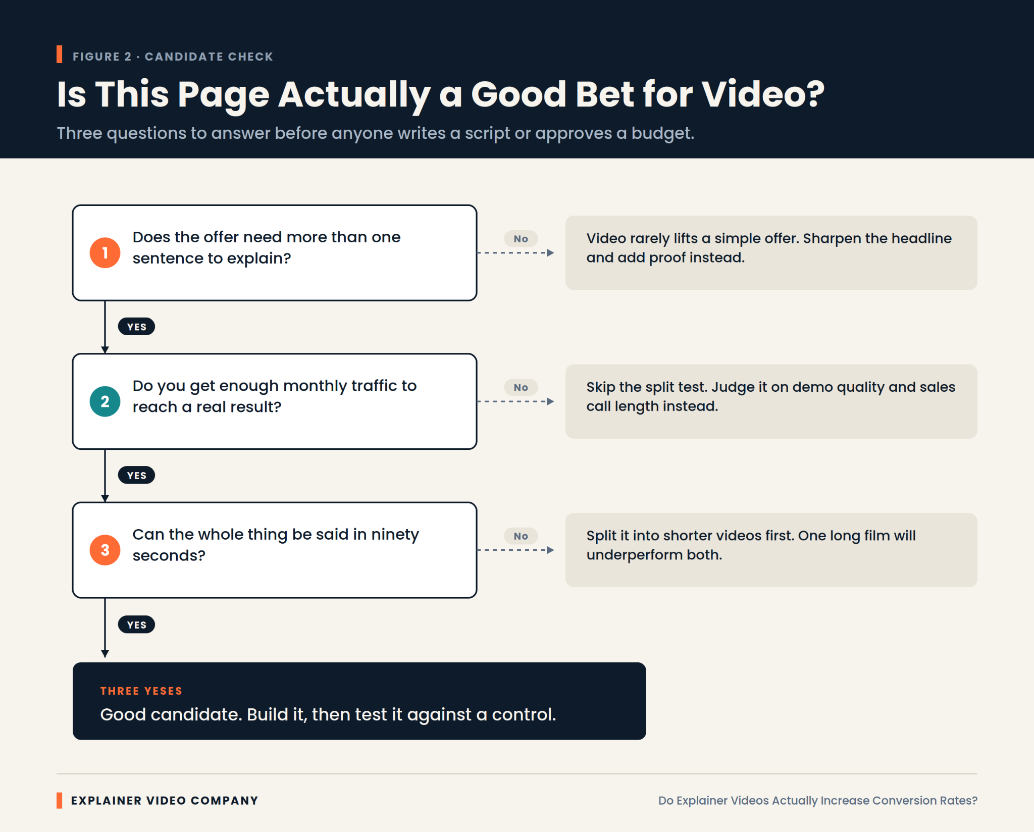
It fails whenever comprehension isn’t the problem. Several situations reliably produce no measurable lift, and recognizing them saves real money.
Price objections don’t respond to explanation. If visitors understand the product perfectly and think it costs too much, a video restates the thing they already rejected.
Trust gaps need proof, not narration. Missing reviews, no security information, and an unfamiliar brand are fixed with evidence rather than motion graphics.
Broken funnels swallow every upstream gain. A signup form demanding fourteen fields will absorb whatever improvement the video created.
Wrong traffic is the quietest failure. If your visitors were never plausible buyers, explaining the product better just helps them leave with more information.
There’s also the case where the video competes with itself. Pages carrying a video, a demo booking widget, a chat prompt, and a free trial button give visitors four things to do at once. Attention splits, and the video takes the blame for a layout problem.
Run the Test Properly or Don’t Claim the Result
Measure with a control group, because without one you’re just observing that time passed. This is the step most teams skip and then regret in the next budget meeting.
Split traffic between the page with the video and the page without it, running both simultaneously. Comparing this month to last month tells you nothing, since seasonality, campaign changes, and traffic mix all moved underneath you.
Let it run to a real sample. Most pages need thousands of visitors per variant to detect anything smaller than a large effect, and stopping early because the first few days looked good is how imaginary wins get reported.
Run it for whole weeks. Weekday and weekend traffic behave differently, and a test ending on a Wednesday quietly overweights one kind of visitor.
Change one thing. Serious explainer video conversion optimization means resisting the urge to redesign the page at the same time, because then you learn nothing about either change.
Regulated Sectors Play by Different Numbers
Expect smaller measured lift and longer timelines in regulated industries, and judge the video by different criteria there. Financial services, healthcare, and insurance all behave differently.
Two forces push against a clean result. Compliance review strips out the specific claims that make a video persuasive, and buying cycles run long enough that the conversion you’re measuring is a form fill rather than a sale.
That doesn’t make video less valuable in these sectors. It makes conversion rate the wrong scoreboard. Lead quality, sales cycle length, and how often prospects arrive already understanding the product are better measures. Our piece on fintech explainer videos covers how to work within review constraints without producing something toothless.
What Does the Video Actually Have to Return?
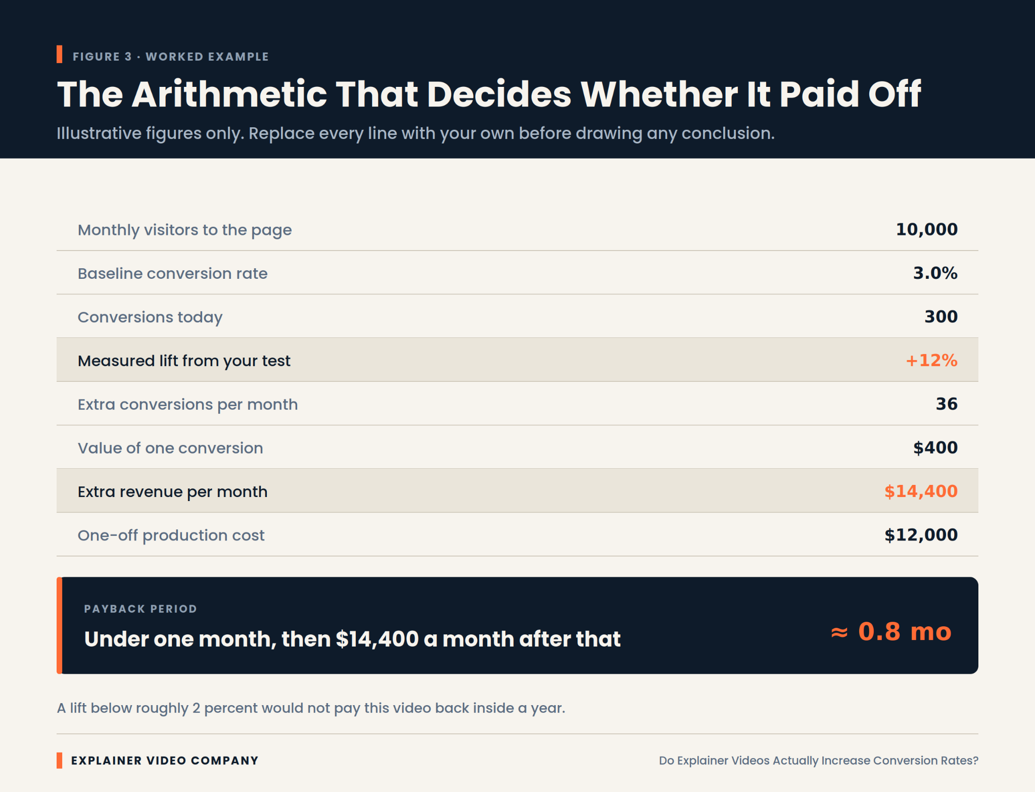
Work out the break-even lift before you commission anything. It’s simple arithmetic, and it converts a vague hope into a number you can hold the project against.
Take monthly visitors to the page, multiply by your current conversion rate, and you have today’s conversions. Decide what one conversion is worth. Then calculate what percentage improvement would cover production cost inside a year. That figure is your threshold.
Sometimes the threshold is comfortably low and the decision is easy. Sometimes you discover the page needs a 40 percent improvement to break even, which is a strong signal to spend the money somewhere else.
Cost is the other half of any explainer video ROI calculation, and it varies enormously between suppliers. Our guide on choosing the best explainer video company for your business covers what actually drives the quote.
Final Words
The honest answer to the title question is a qualified yes. Explainer videos increase conversion rates on pages where visitors are leaving confused, and they do very little on pages where visitors are leaving for any other reason.
So diagnose before you commission. Check whether comprehension is genuinely your bottleneck. Calculate the lift you’d need to break even. Keep it short, put it above the fold, and test it against a real control.
Explainer Video Company works this way because it produces defensible results rather than flattering anecdotes. If you’re weighing whether a video is the right spend for a specific page, an experienced explainer video production studio should be willing to tell you when the answer is no.
