
A strong fintech explainer video does not start with infrastructure, APIs, or a screen full of charts. It starts with a very simple question: what is confusing the customer right now? That matters even more in fintech, where users are being asked to trust a new product with their money, identity, or business operations.
Regulators and consumer-facing financial organizations already stress the value of plain language, and fintech onboarding flows are full of moments where clarity affects trust, compliance, and conversion.
The mistake a lot of founders make is thinking the product is hard because the market is sophisticated. Usually, that is only half true. The product may be sophisticated under the hood, but the explanation does not need to be. Customers are rarely asking for the architecture. They are asking what this does, why it matters, whether it is safe, and what happens next.
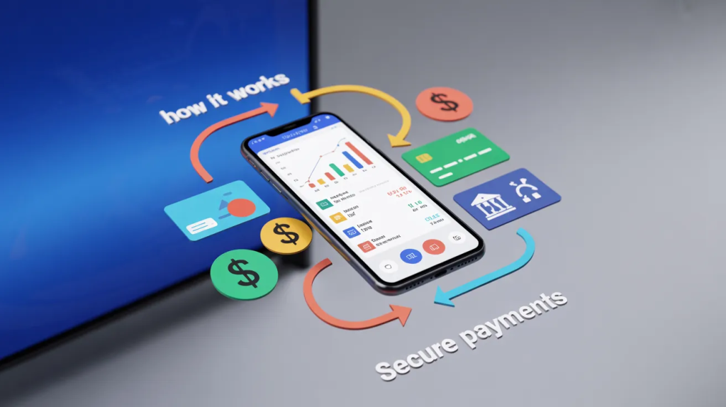
Plain English Is a Trust Tool, Not Just a Writing Style
In most categories, confusing copy is annoying. In fintech, it is expensive.
If someone does not understand how funds move, why identity checks are required, or when they will see value, they hesitate.
Stripe’s onboarding and fintech resources repeatedly show how setup, verification, and risk controls sit right at the center of the user journey, while Plaid makes the same point from the onboarding side: friction and unclear requirements can hurt customer satisfaction and conversions.
That is why smart startups do not treat clarity like a polish pass. They treat it like a product strategy.
This is also where a good explainer video company earns its keep. Not by making the product sound flashy, but by translating a dense offer into something a buyer can repeat back to a teammate in one sentence.
The best fintech teams write for the customer who is interested but skeptical. That person is not dumb. They are careful. They want a clear explanation before they hand over a bank connection, business data, or company documents.
Start With the Problem the Customer Already Feels
The weakest fintech videos start with category definitions.
“Embedded finance is the integration of financial services into non-financial platforms.”
That may be technically fine. It is also a bad opening.
The better move is to start with the customer’s frustration. Maybe payouts take too long. Maybe expense cards are hard to control. Maybe merchants are losing signups during verification. Maybe cross-border payments are too messy. When the problem feels familiar, people stay with you long enough to understand the product.
This is where plain language financial content wins. It replaces abstract labels with situations people already recognize:
- “Your contractors need to be paid this week.”
- “Your team is still reconciling expenses by hand.”
- “New users drop off when the verification flow gets confusing.”
That shift matters because fintech products often combine several moving parts at once. A wallet may include onboarding, compliance checks, balances, transfers, permissions, and reporting. None of that should hit the viewer all at once.
Explain the Outcome Before the Mechanism
A lot of startups are proud of how their engine works. Fair enough. The problem is that buyers care about results first.
They want to know what gets easier after they start using the product.
If you explain the mechanism too early, the message collapses into jargon. If you explain the outcome first, the mechanism becomes easier to absorb. That is one reason explainer videos remain such a strong product-education format.
Vidyard cites research showing that 96% of people have watched an explainer video to learn more about a product or service, and 68% say they would rather learn about a new product or service from a video than text.
Wistia’s current State of Video reporting also shows just how heavily businesses continue to invest in video strategy and measurement.
For fintech, this usually means building the story in this order:
- Problem first.
- Outcome second.
- Process third.
- Proof fourth.
That structure works especially well in a financial product explainer video because it mirrors how real buyers think. They do not begin with the system diagram. They begin with, “Will this save me time, reduce risk, or help me get paid faster?”
Break the Product Into One Decision at a Time
Fintech founders often try to explain the whole platform in one go. That is where the script gets bloated.
A cleaner approach is to isolate one decision per beat.
If the product handles merchant onboarding, do not pile onboarding, risk scoring, settlement logic, and reconciliation into the same sequence. Start with the first user decision. Then move to the next.
Stripe’s merchant onboarding guidance and identity-related setup materials make it pretty clear that these flows involve multiple stages and requirements, which means the explanation also has to respect that staged experience.
This is exactly why motion graphics services work so well in fintech. Good motion design can reduce the mental load of the explanation. It helps viewers follow cause and effect without forcing them to read a wall of UI or parse a dense verbal script.
For example, if your product shortens the KYC onboarding process, the video should not start by naming the regulation. It should show what the user sees:
- Upload your ID.
- Confirm your business details.
- Get verified.
- Start using the account.
That sequence is easier to trust because it feels concrete.
Replace Category Jargon With Everyday Consequences
Some fintech terms are useful internally and terrible externally.
That does not mean you can never use them. It means you should earn the right to use them after the audience already understands the basics.
Take embedded finance. The term matters. It is real. Stripe, Bain, and PwC all describe it as financial services built into software or non-bank experiences. But most end users do not wake up looking for “embedded finance.” They want invoicing with built-in payments, software with cards, or a platform that lets them hold funds without jumping between tools.
So instead of leading with the label, lead with the experience. Then bring the label in once it makes sense. That is how an embedded finance explainer should be written if the goal is comprehension rather than posturing.
The same rule applies to other fintech languages:
- Don’t say “multi-rail payment orchestration” before the viewer knows what problem it fixes.
- Don’t say “real-time treasury visibility” before the viewer knows what they can finally see.
- Don’t say “tokenized credential layer” before the viewer knows what becomes safer or faster.
A lot of teams also get better results with 2D explainer video services here because simple visuals force the script to stay honest. If the sentence cannot be visualized clearly, it often means the sentence is still too abstract.
Show the User Journey, Not the Internal Architecture
Founders love explaining what sits behind the curtain. Customers want to know what happens on stage.
That is why the clearest fintech videos are built around user flow. Not backend complexity. Not feature inventory. Not the company’s roadmap.
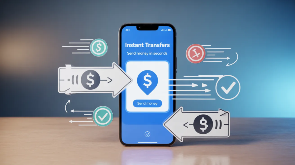
If your product helps businesses accept payments, the script should make payment processing explained in plain steps. If it helps consumers store and move money, the script should feel like a digital wallet explainer, not a software manual.
If it supports onboarding, show the screens, choices, timing, and reassurance points in the order the user will actually experience them.
This also overlaps with fintech startup video marketing more broadly. The best-performing story is usually the one that makes the buyer feel less intimidated, not more impressed.And if the product behaves more like software than a traditional finance product, a team may even borrow structure from SaaS explainer video production services: open with friction, show the workflow, trim the jargon, and end on the clearest usable result.
Prove It Is Safe Without Sounding Like a Terms Page
Fintech buyers do not just need clarity. They need reassurance. That is why the best scripts answer the trust question early, before the viewer starts inventing worst-case scenarios in their head.
This is where a customer onboarding video can do a lot of heavy lifting. It can show what information gets collected, why it is needed, what the user can expect during review, and how long the process usually takes. Plaid’s onboarding guidance leans on the same principle: reduce unnecessary friction, make steps feel manageable, and remove confusion that hurts conversion.
The important bit is tone. You do not want to sound defensive. You want to sound clear and prepared.
Instead of saying:
“We maintain robust compliance and security protocols.”
Say:
“Your business details are checked during signup so your account can be approved and protected.”
Same meaning. Far less corporate fog.
Show One Slice of the Product, Not Every Feature You Built
Founders often worry that simplifying the product will make it look smaller than it is. In practice, the opposite is usually true. When the explanation is focused, the product feels easier to adopt.
This is where a fintech product demo video can help, but only if the team knows what the demo is doing. It should not be a screen recording with a voiceover reading menu labels. It should walk the viewer through one clean use case with just enough interface detail to prove the workflow is real.
That approach lines up with how business video is being used more broadly. Wistia’s 2025 State of Video material shows that companies continue to invest heavily in video for business communication and performance, which is a good reminder that video works best when it is planned around a specific job, not produced as filler content.
In other words, pick the one path that matters most:
- Sign up and verify
- Send the first payment
- Issue the first card
- Reconcile the first transaction
- Connect the first account
That is enough. You do not need the whole product tour in one sitting.
Write for the Second Conversation, Not Just the First View
A lot of teams think the video’s job ends when the viewer finishes watching. Not really.
The real test is whether the buyer can explain the product to someone else afterward.
Can a founder send it to an investor and say, “This is basically what we do”?
Can a product lead share it internally?
Can a sales rep use the same language on a call without falling back into jargon?
That is what separates a decent explainer from a strong financial services explainer video. The strong one creates language that the whole company can reuse. It turns a complicated product into a clean, repeatable story.
And that matters because fintech buyers often need internal buy-in. They are not just making a personal decision. They are pulling teammates into the evaluation, asking operations, finance, compliance, or product to weigh in. A confusing message gets weaker every time it is repeated. A clear message gets stronger.
Frequently Asked Questions
Final Words
Fintech startups do not win trust by sounding more technical than everyone else. They win it by making technical products feel understandable, usable, and worth trying.
The clearest videos focus on the customer’s problem, show the outcome before the mechanics, and explain sensitive steps without sounding stiff. That is what moves a product from “interesting” to “I get it.”